Ticketbis was a secondary marketplace for music, sports and other event tickets. They scaled the business fast into Europe, South America and Asia before getting acquired by Ebay (through Stubhub) in one of Spain’s biggest startup exits until now.
My role
I was part of an 8 member team including UI, UX, research and front-end roles. I was one of the UX designers. For this feature I acted as the lead designer getting help from one other designer.
The challenge
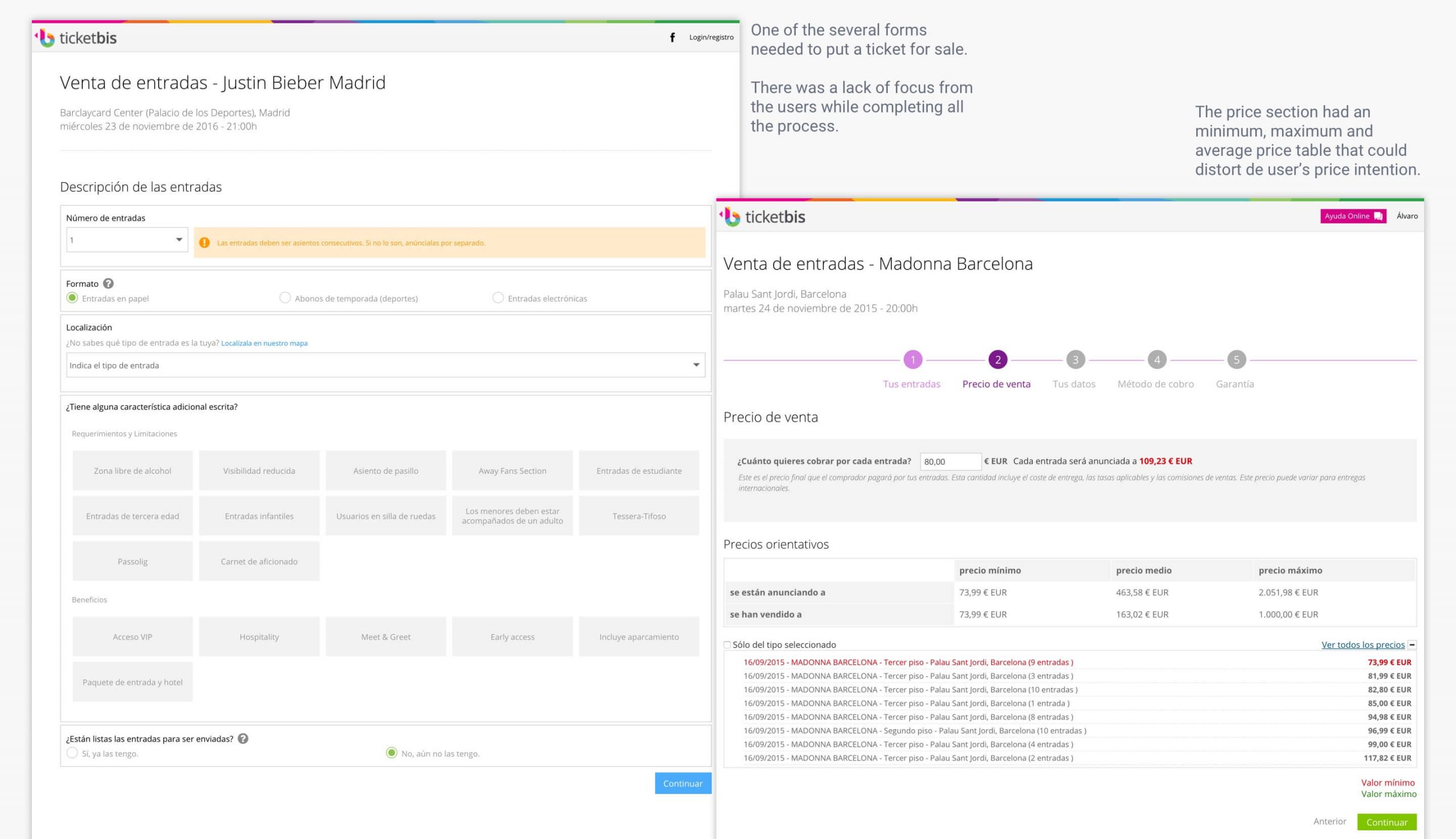
The process of publication consisted in a series of forms where the user enters the pertinent data to be able to put their tickets for sale. The process is based on four steps: Description of inputs, sales price, user data and transaction data.
The intention of this project was to devise a new process model to achieve two clear goals: Get the user to correctly complete all data and provide help to the user without distorting their price intention.
Original situation when I approached the redesign
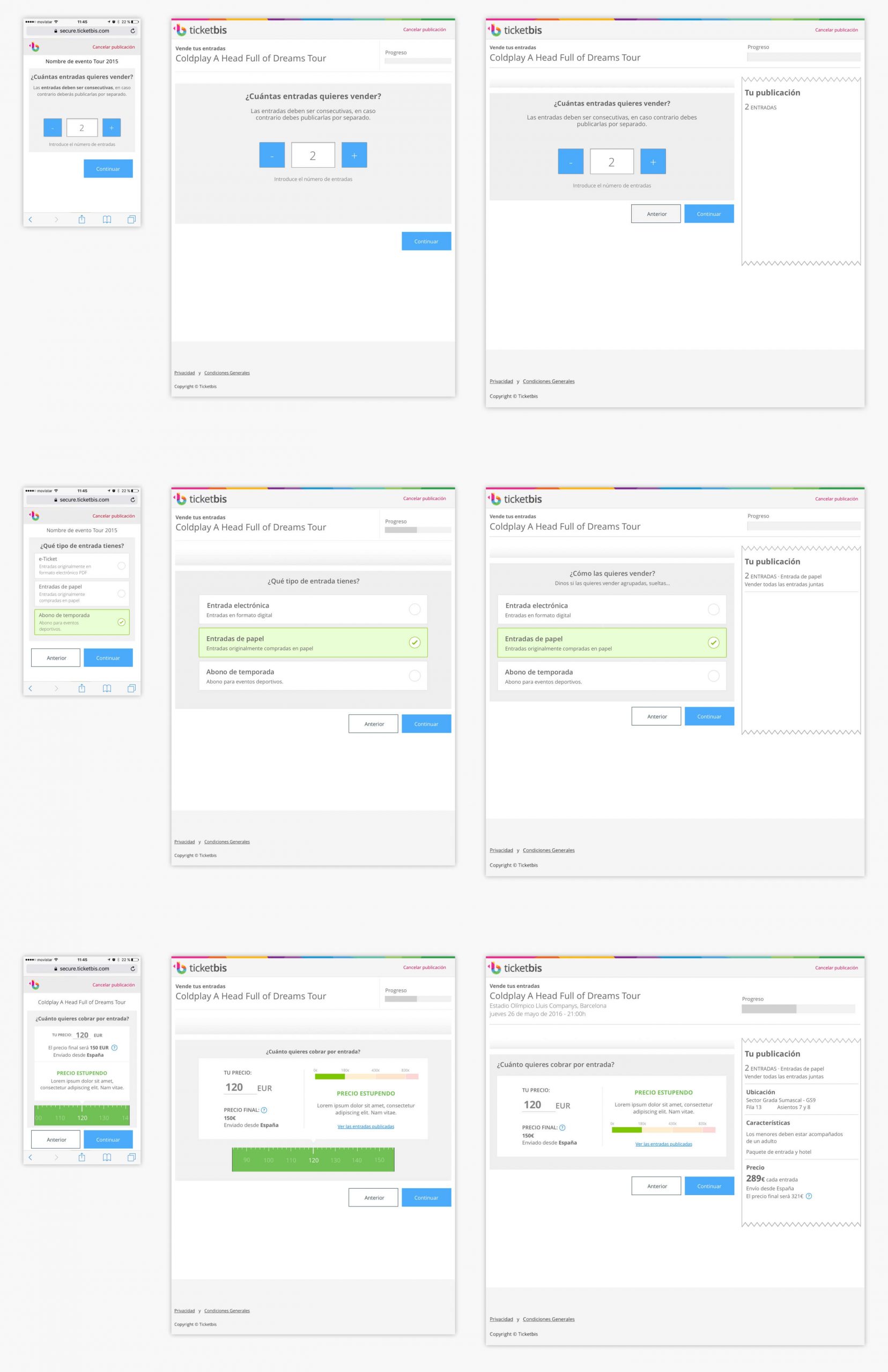
For our solution a step-by-step model was chosen to segment the previous long forms into small steps with focused questions. This decision was made with the intention of creating more focus on the customer and to adapt the experience to both mobile and desktop environments.
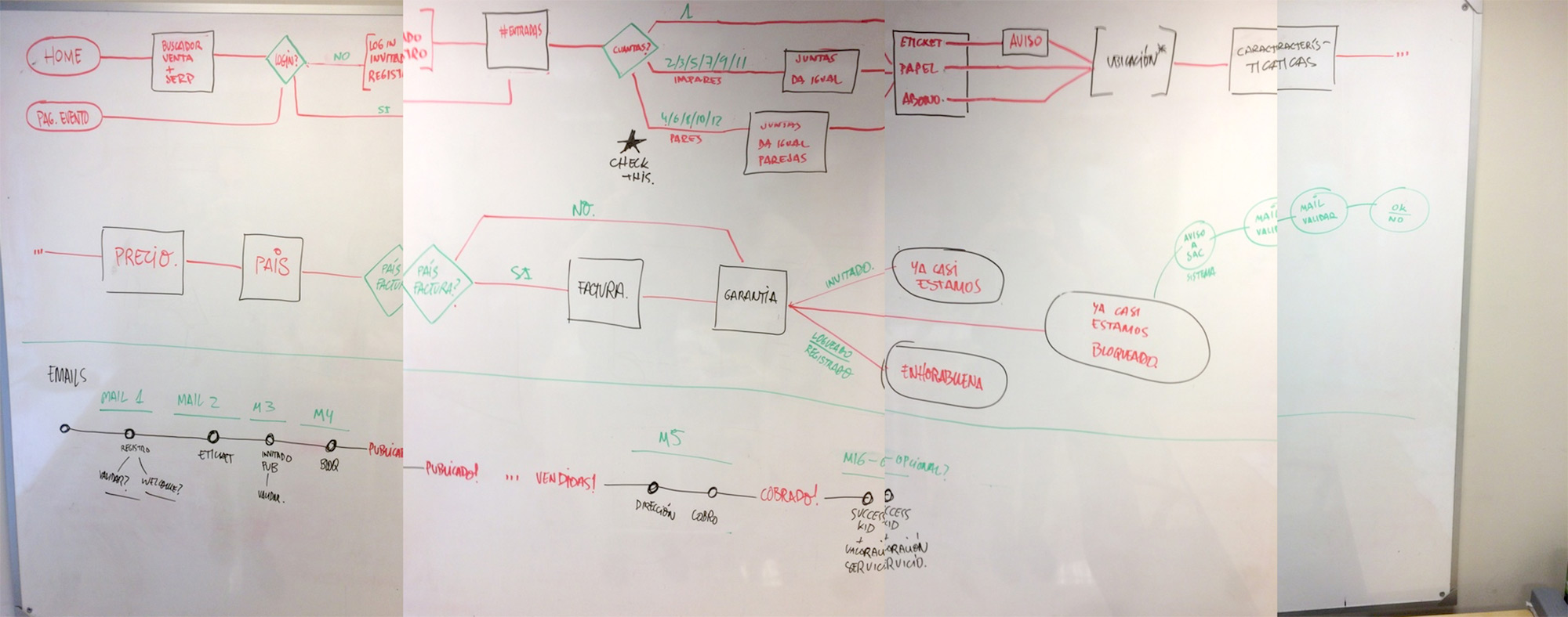
Creating user flows helped to define the order of the questionnaire and map all the possible scenarios we were facing, which were plenty (physical ticket, digital ticket…).
First iterations to arrange all the steps through the process.
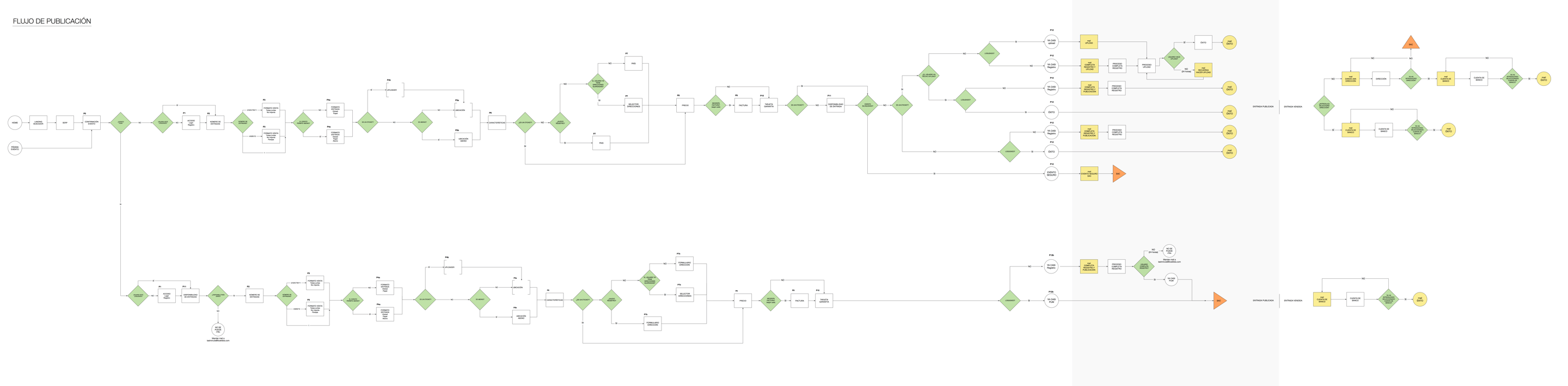
Final navigation flow with all possible cases. To see a bigger version click here (pdf).
Wireframes of some steps of the process designed for different breakpoints (mobile, tablet, desktop).
Pricing tool
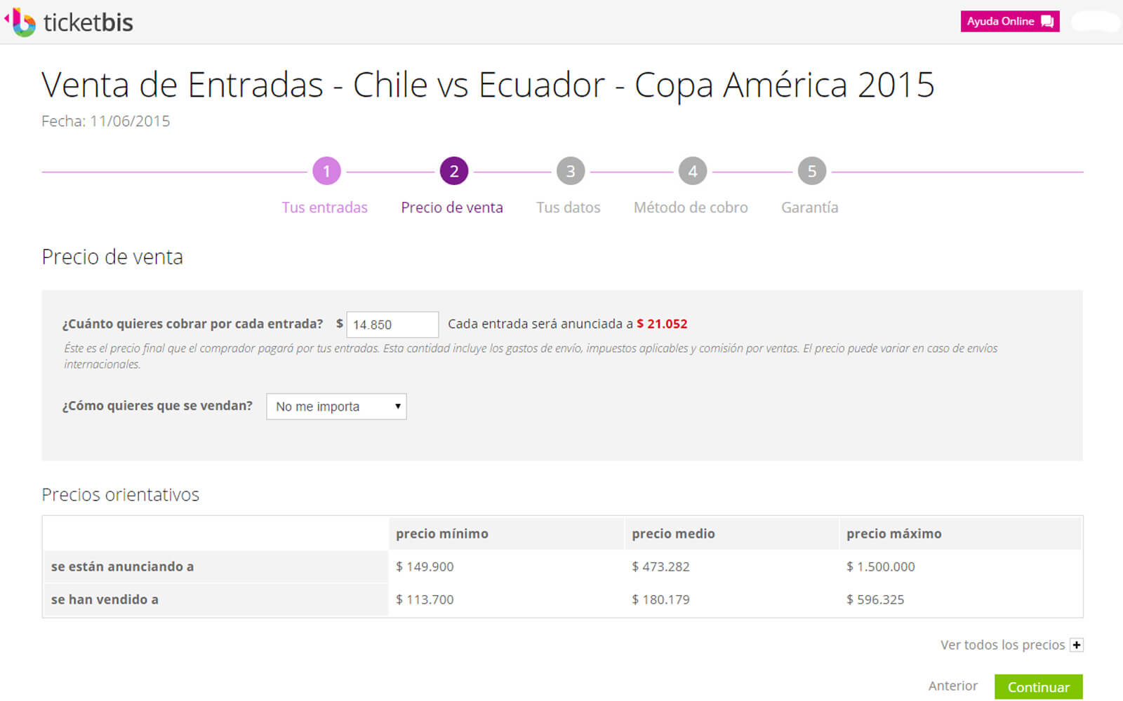
For the pricing step we wanted to provide information in a more human tone than the current price tables. These tables were confusing for the perception of the value of their tickets since they showed as reference the average prices and the extremes including the most expensive, distorting the average price shown.
The table showed the average and extreme prices, distorting the price value the user had in mind.
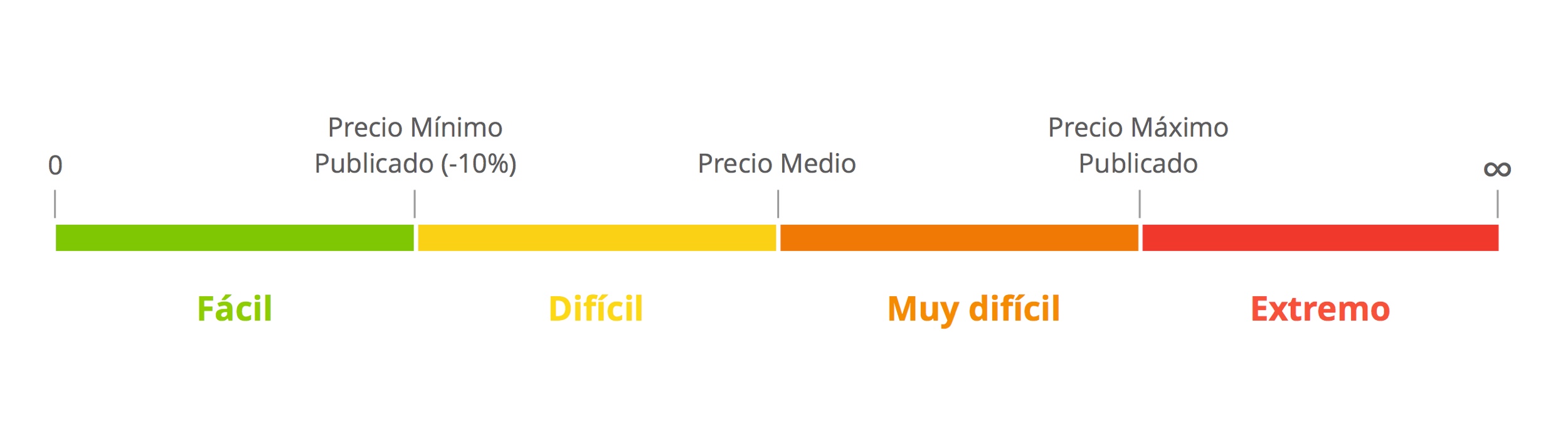
The new proposal eliminates the price tables and helps to incorporate the price with a more human tone. It is still based on minimum, medium and maximum prices but representing them in stripes of color and messages based on the ease of sale.
One of the objectives of this project – set by stakeholders – was to encourage the users to publish with cheaper prices, so the treshold from “Easy” to “Difficult” was placed at the minimum published price minus 10%, this way we directed the user to keep this price range competitive.
Color code providing information os ease of sale.
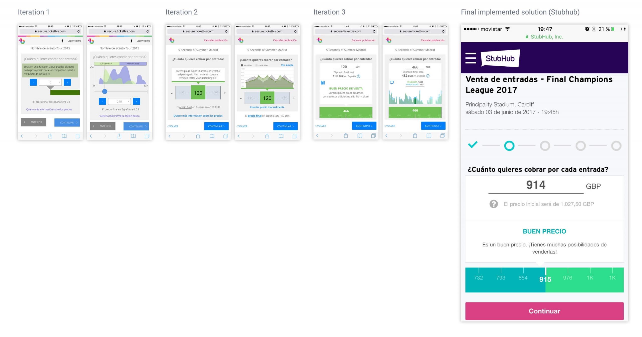
Wireframe iterations for the design of the screen and the final solution implemented at Stubhub
Finally, the shape of the pricing tool added a fun interaction pattern mocking a rolling tape, where the customer could swipe through the price band. This band was coded with physics so it would move with inertia and faux fade motion, depending on the intensity it was swiped. Also, for accessibility the user could also just type the price in the text field.
This feature was implemented at Ticketbis with good metrics for user adoption along with lowering the drop of users on more sensible questions. It was also used in next iterations, once Ticketbis got acquired by Stubhub.